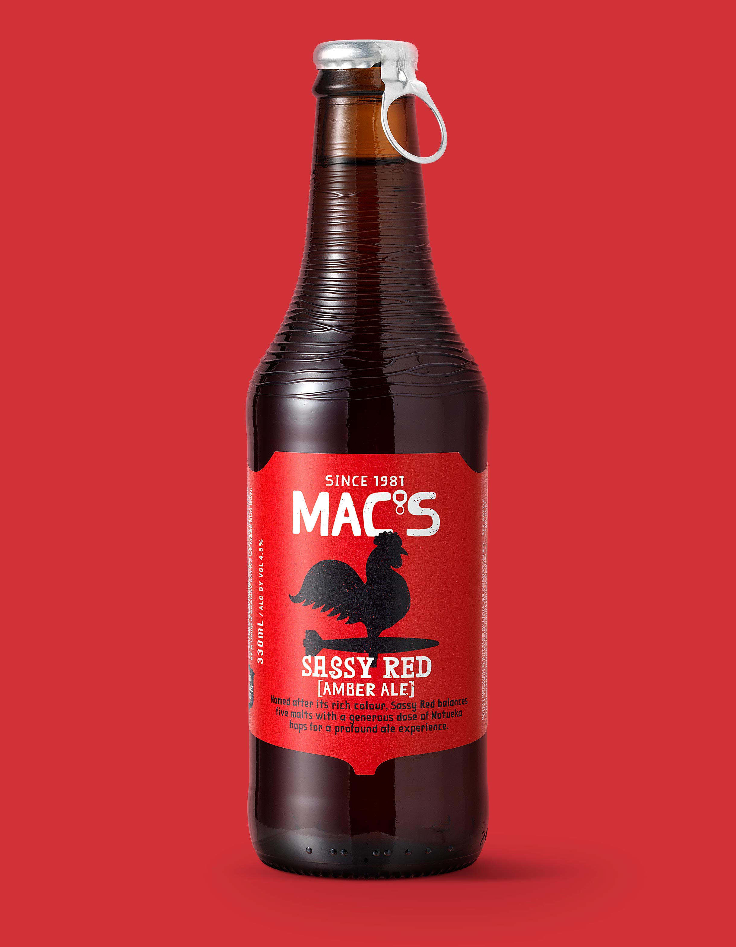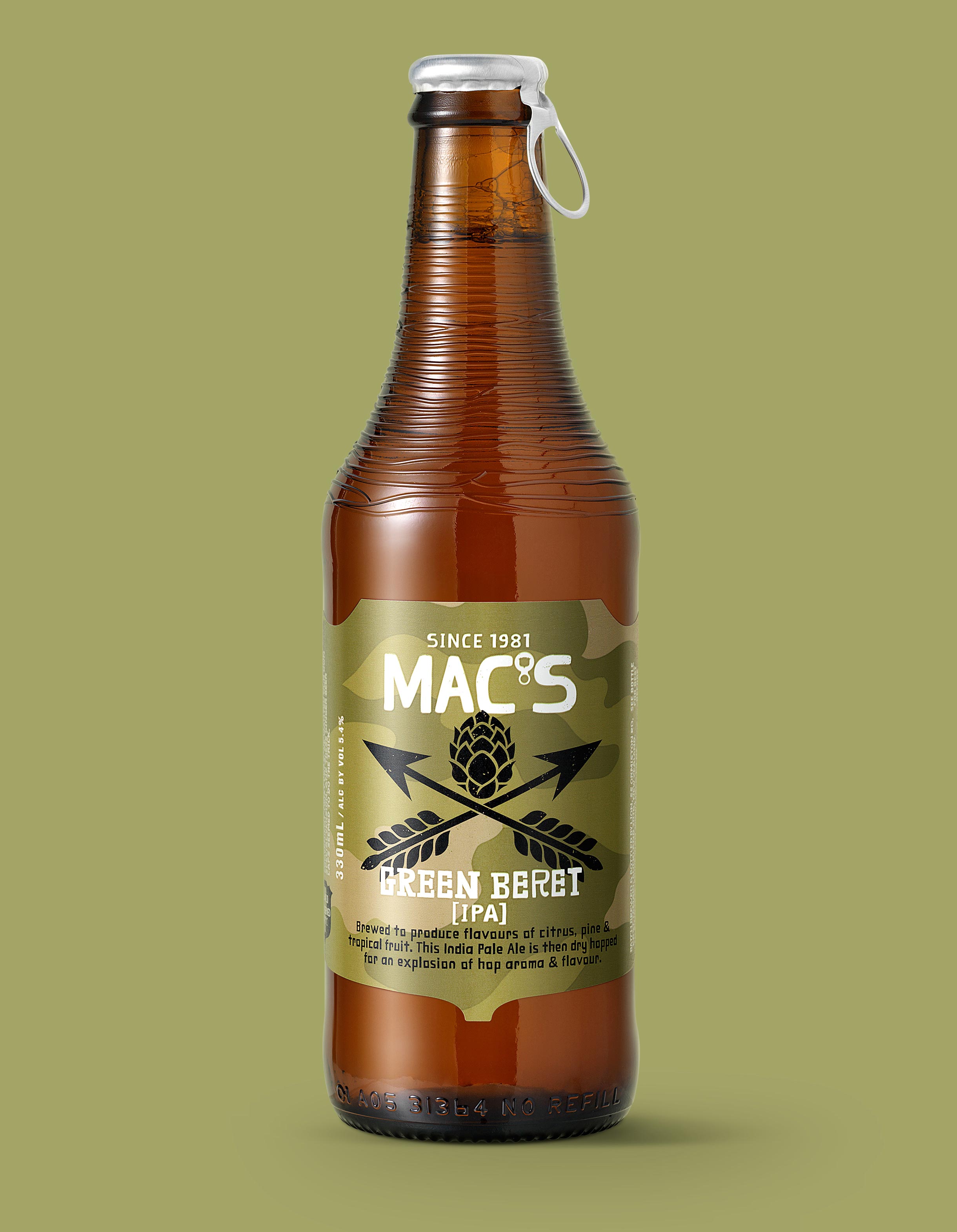


Rebranding Mac's was primarily about reflecting its world-class brewing credentials and creative spirit. Interest in craft beer has grown massively and these days people want to know about ingredients, processes and provenance. Mac’s had to reassert itself as an authority and a creator. With such strong assets as the rib-necked bottle, pull cap, distinctive hand cut font and established tone of voice, there was a solid foundation to build on. A new logo and introduction of a die cut shield-shaped label were both worthy updates. Then we focused on details, individualising each beer through the use of colour and its own unique, characterful icon. We added a flavour scale to the labels and cartons to help drinkers navigate sessionable to challenging liquids at a glance. Brewing notes give a taste of what's to come and awards are now called out on pack. An upgraded range of sophisticated ciders was introduced with the relaunch as well as the new brews Three Wolves, Green Beret and Mid Vicious, Mac's first mid strength offering.
